Selecting appropriate framework is the most crucial step for developing well structured, lightweight, efficient and up-gradable projects. Also, it helps you to save your time and focus more on productivity.
Fortunately, hundreds of front-end frameworks available out there, but we are only familiar with a few popular ones like Bootstrap & Foundation. Today we are going to introduce you with a few unknown framework (more specifically, Bootstrap Alternatives) that will help you to give wings to your project. Each of them is known for their unique features and comes with limited or right amount of elements and styles. Have a look.
Table of Contents
26. TukTuk

TukTuk is a lightweight framework which is divided horizontally into a series of twelve columns and vertically into rows. It also includes some basic styling for tables, typography and a few user interface like models, navigation bar etc.
25. Base

Base is simple, fast and lightweight framework built (on Normalize.css) for all devices. It is packed with all necessary components to get you started on your next web project. Furthermore, it works with all modern as well as older browsers (IE7+).
24. Mueller
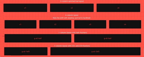
Mueller is a modular grid system (based on Compass) for both responsive and non-responsive websites. It gives you the full control over gutter width, column width, baseline grid and media queries.
23. Susy
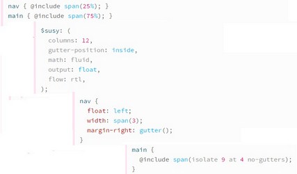
Yet another powerful grid system that allows you to build a web layout in any kind of column you want. Through Susy, you can build 5, 12, 24, 48 or unequal column. Overall, it is designed to evolve with your project for the long haul.
22. YUI
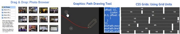
YUI is an open source JavaScript and CSS library for creating rich interactive applications. Its core, lightweight and modular architecture makes it fast, scalable and robust. Here you can build effective and maintainable applications quickly either on desktop browser or mobile devices.
21. Jeet
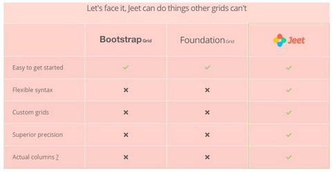
Jeet is a smart CSS grid system with no rigid twelve column rules. You can pass any decimal, fraction or combination (of two) to build a complete custom grid. It can work in any environment including static website in SCSS, in rail application or a Node package in Stylus.
20. Responsive
Responsive is powerful, accessible, developer friendly framework for building responsive sites. This tiny framework allows developers to write efficient code and lower costs. It also comes with the series of jQuery plugin and methods that offers basic webpage component in a responsive format.
19. Furtive
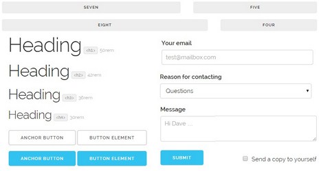
Furtive is a CSS micro-framework that includes a small footprint, cutting down on the bandwidth required for downloading CSS. It can use cutting edge technology like SVGs, flexbox and limited vendor prefixing. The framework comes with a gulpfile and some common components like forms, buttons, tables, media objects, typography, lists and more.
18. Basscss
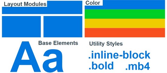
Basscss is lightning fast, modular CSS for designers. It includes a lightweight set of base element styles (like core typographic, form, button etc), layout modules, utilities, color style for speed, scalability and performance.
17. Cardinal
Cardinal is a modular mobile first CSS framework to prototype, build and maintain responsive sites and applications. It is built on top of LESS, Sass and Stylus. It features useful variables, sensible mixins, flexible grid system and encapsulated styles for common user interface components like tables, buttons, forms etc.
16. MontageJS
MontageJS is an open source HTML5 framework (best for designing single page application) enriched by the breadth of their ecosystem. It uses time-tested design pattern that allows you to build a modular architecture for your project. In order to deliver high performance it supports implicit event delegation, two way data binding between components, a managed draw cycle and component oriented templates.
15. Metro UI
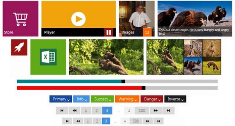
Metro UI CSS is a simple responsive framework to create websites with an interface similar to Windows 8. It includes a set of common components like button, sidebar, tab, tiles, visualization etc.
14. Onsen UI
Onsen UI is a custom element based HTML5 framework for developing responsive sites and hybrid apps. It works well with PhoneGap and Cordova. Onsen is an open source tool that features font awesome, built in theme roller and screen transition.
13. Concise
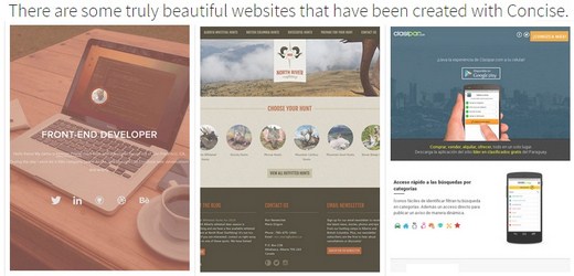
Concise is a CSS framework, specially designed for mobile devices. It includes a great base styling, support for Vanilla CSS & SASS, and many plugins that make the framework expandable.
12. Groundwork
Groundwork is flexible and responsive framework for creating accessible & scalable web application for all devices. It is easy to customize, suitable for rapid prototyping and supports semantic markups with ARIA attribute selectors using Sass.
11. Topcoat
Topcoat is a robust front-end framework built by the Adobe team for creating clean and fast web apps. Every single component in Topcoat is benchmarked for performance. It offers custom themes, icons, open source fonts, UI kit and CDN resources.
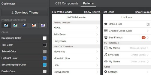
10. UIkit
UIkit (built in LESS) is a simple, lightweight and modular front-end framework for developing powerful and fast web interface. It gives you a huge set of CSS, HTML and JS components, which is easy to customize and extend.
9. Skeleton
Skeleton is responsive CSS boilerplate built with mobile in mind. You should use skeleton if you are working on smaller projects and don’t need unnecessary utilities present in the larger framework. It includes all necessary components like buttons, forms, typography, grid system, lists, tables and other utilities.
8. HTML KickStart

Kickstart is ultra-lean HTML, CSS and JS building blocks for rapid site development. It is packed with thousands of basic and useful components like buttons, lists, menus, tables, typography, tooltips, 400+ icons/glyphs, tabs, breadcrumbs, slideshows, forms and much more.
7. Ink
Ink interface kit can be used for designing responsive web interfaces quickly. It contains CSS, javascript and their minified versions. Moreover, it is packed with grid system, fonts, lists, raw color, combining styles, button groups, toolbars and more.
6. Material UI
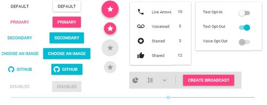
Material UI is a CSS framework and a huge collection of react components that implements material design. It is packed with some elegant elements including data picker, dialog, dropdown menu, icons, icon buttons, left navigation, tabs, switches, snackbar and more.
5. Materialize

Materialize is a modern, responsive framework based on Google’s material design. It helps to speed up the development process and enhance the user experience. It is packed with some new features including ripple effect animation, card design, drag out mobile menu, Sass mixin and more.
4. Bootflat
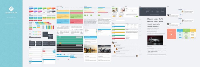
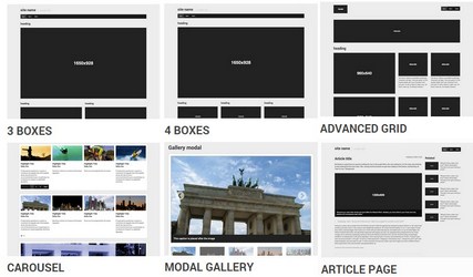
Bootflat provides an easier, faster and less repetitive way for web developers/designers to create great web applications. It’s an open source flat UI kit that offers a free PSD. All components are built with HTML5 and CSS3. Bootflat uses nav, section and header to create the layout. It also comes with numerous splendid color schemes and allows easy customization.
3. Gumby
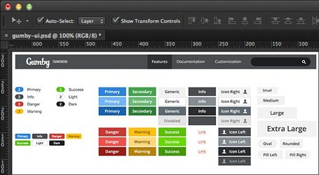
Gumby is a simple, responsive, flexible CSS framework powered by Sass. It gives you complete control over your choice of color, font, grid with, button and more. Furthermore, the framework is packed with numerous components like grid system, toggle & switches, fancy tile, shuffle layout, responsive images, UI kit and more.
Read: 40 Useful JavaScript Frameworks for Developers
2. Pure
Pure is a small responsive CSS module built on Normalize.css. Unlike other framework, its design is minimal, unopinionated and flat. It provides layout, styling for native HTML elements and a few common UI components including grid, form, button, table, menus, skin builder etc.
1. Foundation
Recommended: 35+ Useful HTML and CSS Frameworks For Web Designers
Foundation is currently the most advanced responsive framework after Bootstrap. It’s a professional choice for designers/developers for creating various products, apps and services. It is packed with some awesome features like fast click, GPU acceleration, medium grid, off-canvas and numerous building blocks that you can drop into any foundation project.
Hi Varun,
This is really a great collection of Front-end Framework. As a blogger, I also need to design my blog and hope this list will definitely help me to improve my blog design layout.
Thanks for the great sharing.